
Someone was kind enough to send me the link to the site for the extremely diluted grulla appaloosa mare in a previous post. There are many more (high quality!) pictures of the mare there.
And now back to work! I have been mired in the got-to-make-publication deadlines, but I will return to studio things soon. (Someday I will write for a magazine and not be the editor's "problem child"... really, I will!)
Thursday, August 28, 2008
Friday, August 22, 2008
Why we do what we do

I think for most artists who focus on them, there is just something about the spirit of the horse and their bond with mankind. It draws us to them again and again. I thought this picture of my youngest son, Matthew, and his best buddy, Rose, captured a bit of that.
Black it is!
In a post last week, I mentioned that I was sending a hair sample from my appaloosa mare to UC Davis, in order to find out what color she truly was. Underneath her white pattern, the base color was an odd brown shade. I found over time that most horse people were inclined to call her black, but her lower legs were tan. Typically when black horses fade in the sun, their lower legs retain color in the same area that is black on a bay horse. This Percheron is a good example. He looks bay, but genetic tests show him to be black. That is why the hair above the hoof is often a good indicator for determining if the horse is faded black or a liver chestnut.
The hair on my horse's lower legs was most definitely not black. If anything, it has always been the palest area of color on her, as this winter picture of the back of her leg shows.

So it would be reasonable to believe she was chestnut. Still, to someone who looks at color a lot, there was something "off" in the tone for her to be chestnut. Certainly some chestnuts are a rather dull color, but the tone was enough for me to suspect she was some kind of dilute. Recent studies on the appaloosa patterns had shown that many black appaloosas had their color altered, and I had long noted that many appaloosas had base colors that were just hard to pin down as any specific thing. I suspected that this was what was going on with Sprinkles, but without a test I couldn't really be sure.

Yesterday I received her test results, and my guess was right. She is "aa" - genetically black. She carries the chestnut gene (e) but is not herself chestnut.
With that in mind, I thought it might be fun to post a group of photos showing some lower legs and the difference in tone between some of the colors. This is the kind of thing that artists need to keep in mind when painting different colors, because getting the tone right makes all the difference in portraying a given color.
One caveat though. Photographs are not the best way to really see these differences. All the ways we record and transmit images (film, printing, monitors) can distort color, and with something like this what we are dealing with are very subtle differences in tone. These are my own images, taken with the same equipment in close proximity to one another, but still viewing these colors in real life (preferrably side-by-side) is the best way to see. Indeed, the tone in color is really best studied from life because the camera rarely captures what is so obvious in person. But we will do the best we can with what is possible over the internet!

These are the legs of a sooty palomino pony. Notice how yellow in tone the lightest areas are. "Yellowness" is one of the best indicators for the presence of the cream gene. (For those that downloaded the new color charts, these legs go with the palomino pony pictured on the second page.)

These are the legs of a red silver pony. This horse is genetically bay, and you can see the unaltered red hairs on the upper leg. His black lower leg has been diluted by the silver gene, turning it a bluish chocolate. The overall tone on the lower legs is very cool, especially compared to the yellow of the palomino above.

And these are Sprinkle's legs. Again, she's genetically black so like the silver legs above, this is a diluted form of black. The color isn't cool, however. It isn't yellow, but it's not really red either. If I had to call it something, I would say it is a bronze tone. I would also add that she does not really fade to this color; it's pretty constant through the seasons.

Here is a side-by-side comparison of the leg color, with an addition of a sooty chestnut to compare against a truly red leg. (With all these images, you can click to get a larger version.)

And finally here is Sprinkles' legs beside a flaxen chestnut leg and a truly black leg, showing the contrasting tones.
No one really knows at this point why the pattern dilutes the black on some appaloosas, and of course some aren't diluted at all. But it does happen with some frequency, and it offers a neat variation for artists painting appaloosas.
Wednesday, August 20, 2008
In Memory
Scott Alan Jeffreys
December 24, 1966 - August 20, 2002
 My brief moment, sometime around age seven, of being taller than my twin. (He would end up almost eight inches taller than me.)

When people talked about children with Christmas birthdays getting 'cheated' on presents, I used to tell them they should try that birthday as a twin. Four gifts in one! But what do you get a boy and a girl together? Board games. Oh my, did we get board games!

As much as I always loved horses, Scott loved cars. He eventually traded model cars for real ones, but somehow I stuck with both real and model horses.
My mother shared these pictures with me while visiting recently. She had found them going through some old boxes. But my favorite was an old Christmas letter from my grandparents, dated around the same time as these photos. My grandmother writes of us: "Both kids are doing well in school. Scott is meticulous and has lovely handwriting. Lesli is not so neat, and her teacher says she talks too much." I thought those of you who know me well would find that particularly amusing. (My family here - the ones that live with my disorganized, talkative self - sure did!)
And to my Jeffreys and Harbin family members, I am thinking of you all on this day and hoping you find comfort in the many good memories Scott left behind. I love you all - and him - always.
December 24, 1966 - August 20, 2002


When people talked about children with Christmas birthdays getting 'cheated' on presents, I used to tell them they should try that birthday as a twin. Four gifts in one! But what do you get a boy and a girl together? Board games. Oh my, did we get board games!

As much as I always loved horses, Scott loved cars. He eventually traded model cars for real ones, but somehow I stuck with both real and model horses.
My mother shared these pictures with me while visiting recently. She had found them going through some old boxes. But my favorite was an old Christmas letter from my grandparents, dated around the same time as these photos. My grandmother writes of us: "Both kids are doing well in school. Scott is meticulous and has lovely handwriting. Lesli is not so neat, and her teacher says she talks too much." I thought those of you who know me well would find that particularly amusing. (My family here - the ones that live with my disorganized, talkative self - sure did!)
And to my Jeffreys and Harbin family members, I am thinking of you all on this day and hoping you find comfort in the many good memories Scott left behind. I love you all - and him - always.
Monday, August 18, 2008
Updated Color Guide

Cerbero, brown tobiano Neopolitan owned by Emperor Charles VI, painted by Johann Georg von Hamilton in 1725. (Lipizzaner Museum, Vienna, Austria.)

Pluto-Lina, also called Bajazzo, a Lipizzaner stallion born in 1913. This photo is from book Pferde aus Licht und Schatten. (A wonderful book, by the way, even if you cannot read German.)
For years I have published an article, "What's Possible", that outlines the colors and patterns found in some of the more popular breeds. The idea was to give model horse show entrants and judges a better idea of what was accurate (and acceptable) for the breeds they were most likely to see in the show ring. At the end of the year I would update the charts in the article to reflect any new discoveries or changes in registry rules.
This past year, I realized that the charts had reached the point that merely updating them was not enough. They needed an overhaul. Appaloosa patterns are more complex than the current chart reflects. New colors like pearl and Dominant White need to be added, and something needs to be said about mushroom and "light" (or dilute) blacks. There was also a companion article entitled "More Possibilities" that was never published. It had the same kind of information on some of the less common breeds. The more I looked at both articles, the more convinced I became that I just need to get back to work on the book those charts were supposed to summarize!
I'm still working on that, but since I am still a long way from finished it seemed a good idea to at least correct the article and republish it. I know many showers and judges still refer to the charts, so accurate but incomplete information is better than inaccurate information! Newly updated charts (in PDF form) can be found here.
There are a lot of changes, in part because it has been so long since they were last updated, but also because I've made an effort to be a bit more thorough in noting historical ("extinct") colors. (Like the Lipizzaners in the pictures at the top of this post.) The rise in registries with online databases has also allowed me to pin down some of the genes that were previously listed as "unknown".
And finally I should note one entry that is sure to be controversial. Yes, there are questionable circumstances surrounding that horse's papers, and yes, I know the registry has been informed. I had actually delayed uploading these charts, hoping that the issue would be resolved. As of this morning, this horse is still listed on DataSource as a registered purebred. Legitimate or not, unless and until those papers are revoked that color is in the breed.
Wednesday, August 13, 2008
A confession

This is the sign that should have hung on my studio door this summer - Gone Fishing!
I like plans. I dislike the unexpected and I am happiest when there is a clear plan. So Alan and I started our marriage with a plan. I would quit my day job so I could devote myself more fully to my artwork. I would continue to freelance as a technical illustrator while I built up my equine art business. The business would be well-established when we had children, and I could stay at home with them and still work.
When we found out we were expecting our first son, I promptly went out and found a book on raising children while running a home-based business. I had no idea what having a baby in the house might mean to my established work routine, so it seemed sensible to get more information. (My husband finds much amusement in my firm belief that no matter what new thing I must do, someone somewhere must have written a book telling me what to expect.) I still remember following along in the book, thinking the author was making sense until I got to one of the charts. It listed the age of the child in one column, and the number of hours one might reasonably expect to work while at home with the child. And there in the first row, marked 0-6 months, was the number zero. Zero hours – a week. It didn’t get much better, either. If I remember correctly, by age two you were up to five hours a week. I never read the rest of the book, convinced that I didn’t need advice from one of the few people who appeared to be worse at time management than me.
It was the first lesson in what I’ve come to think of as a (now) twelve-year course in humility. I’m still wondering how she managed those five hours at age two.
I spent a lot of time when my children were young wishing for enough personal space to create some artwork. (Or maybe just sleep.) I dreamed of the day that they would head off to school so I could reclaim my career, or at least some small part of it. I told myself that one day, my children would not need me quite so much, and that it would be easier to get work done. And over time that has happened.
That was why when I planned my summer, I assumed that I would be working. The boys did not need my constant supervision. No one would mind, or perhaps even notice, if I was holed up in my studio working. Why, I could finally hold the first-time winner’s lottery I had long wanted to have!
But then something happened. (Parenting Rule #1: Something always happens.) My older son finished fifth grade this year, and he was asked to give the student speech at the graduation. I have always found it odd that my quiet, introverted child enjoys public speaking. He’s also a very respectful child, so I was even more surprised to find him balking at requested edits. Both his teacher and his father tried to no avail. Then the day before the ceremony, I discovered why while volunteering in his class. His classmates were celebrating the lack of homework when I reminded my son that he would spend the evening working on the edits to his speech. Suddenly there were ten boys all shouting that it was perfect – absolutely perfect! – and that he need not change a word. The next day he gave his unchanged speech, full of confidence and own dry humor, to crowd of kids and parents. And it was perfect just as he wrote it. But even more important, I caught a glimpse of my son as his friends saw him and how important this would be to him in the future.
He’s still very much a kid, but it did bring home to me how little time we parents remain central to our children’s lives. For all that the days seemed so (unbearably!) endless when they were really small, time seems to me rather short now. All too soon, my sons will be fully their own people.
So this summer, I have lingered a bit in what remains of my kids' childhood. I’ve wiled away my summer days in their company. Yes, I’ve done some work in the studio, but mostly I’ve spent time with them at the pool and the barn. I've done a little house painting (an activity done with children only if you are brave and don't mind bright colors). I’ve played way too much Monopoly and Uno. I’ve been thoroughly schooled in ancient history (Brandon’s abiding passion) and been routinely beaten at Wii Tennis. In a few weeks, I’ll be back to work and I’ll have to figure out what to do with all the horses I haven’t finished over the summer. But I can’t say that I have any real regrets.
Tuesday, August 12, 2008
More thoughts on striped hooves
In the comments section of the last post, Melissa Gaulding made this observation:

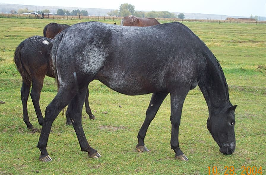
This got me to thinking about the variation in tone on Sprinkle's hoof, and how different they are from Freckles, another appaloosa that shares a pasture with her (above). While the two horses were standing together, what struck me was how opaque Sprinkles feet were compared to Freckles. Shell hooves have always seemed to me to have a slightly translucent quality, and the other mare's feet retained a bit of that.
I wonder if this is just individual variation, or if base color might have something to do with it. Looking at the picture above, Sprinkles and Freckles might both appear to be chestnuts - one a darker liver and the other a true red chestnut. The truth is I am not sure if Sprinkles is genetically chestnut or black. The general rule of thumb is that faded black horses retain their black lower legs, so if the lower leg is faded the horse is most likely dark chestnut.

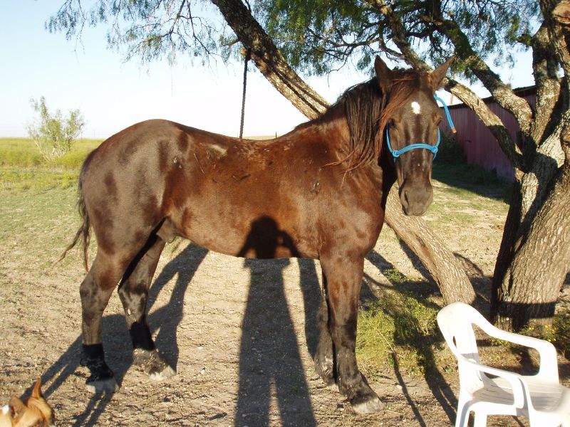
Sprinkles lower legs are faded, which should mean that she isn't black. But the leopard complex gene will often change black base colors to an odd bronze shade that most horsemen find hard to categorize. People around Sprinkles have that problem, not knowing whether to call her black, or chocolate, or grulla. (Grulla seems to be a used as a catch-all phrase by many horsemen, meaning "dark, dull color I cannot identify".) To give an idea of just how dramatically the appaloosa gene can distort the color of a black horse, I'll share a picture of another appaloosa that tested as genetically black.

(I apologize that this is not my photo, nor do I know its source. If it is yours and you would like it removed, please let me know and I will do so.)
All this gave me the final push to have UC Davis test Sprinkles. I have meant to do this for some time now, but at last I have sent the form with her hairs. I still don't know, as Mel mentioned, if there is any true black in nature, but at least I will soon know if I own a truly black horse! And in the meantime, I hope to collect more pictures of appaloosa hooves and see if the striping differs according to base colors.
So Sprinkles' grays in her hoof are going to more green or pink or blue, because the dark coloring isn't "true" black...

This got me to thinking about the variation in tone on Sprinkle's hoof, and how different they are from Freckles, another appaloosa that shares a pasture with her (above). While the two horses were standing together, what struck me was how opaque Sprinkles feet were compared to Freckles. Shell hooves have always seemed to me to have a slightly translucent quality, and the other mare's feet retained a bit of that.
I wonder if this is just individual variation, or if base color might have something to do with it. Looking at the picture above, Sprinkles and Freckles might both appear to be chestnuts - one a darker liver and the other a true red chestnut. The truth is I am not sure if Sprinkles is genetically chestnut or black. The general rule of thumb is that faded black horses retain their black lower legs, so if the lower leg is faded the horse is most likely dark chestnut.

Sprinkles lower legs are faded, which should mean that she isn't black. But the leopard complex gene will often change black base colors to an odd bronze shade that most horsemen find hard to categorize. People around Sprinkles have that problem, not knowing whether to call her black, or chocolate, or grulla. (Grulla seems to be a used as a catch-all phrase by many horsemen, meaning "dark, dull color I cannot identify".) To give an idea of just how dramatically the appaloosa gene can distort the color of a black horse, I'll share a picture of another appaloosa that tested as genetically black.

(I apologize that this is not my photo, nor do I know its source. If it is yours and you would like it removed, please let me know and I will do so.)
All this gave me the final push to have UC Davis test Sprinkles. I have meant to do this for some time now, but at last I have sent the form with her hairs. I still don't know, as Mel mentioned, if there is any true black in nature, but at least I will soon know if I own a truly black horse! And in the meantime, I hope to collect more pictures of appaloosa hooves and see if the striping differs according to base colors.
Saturday, August 9, 2008
Training your eyes
One of my biggest regrets about the time that Alan and I owned our small farm is that I didn't spend more time looking - really looking - at the horses in my backyard. I was painting horses then, of course, but so much of my work was done from what I knew about horses, rather than what I saw. It takes a lot more effort now, with a family to care for and the barn a fifteen minute drive away, just to be around horses, but when I can be there I spend a lot of time looking.
Most recently I spent a lot of time looking at hooves. It was already an area I had targeted to improve with my custom glazes. For various technical reasons, it's a lot harder to get a good hoof on a ceramic horse than a custom or resin.
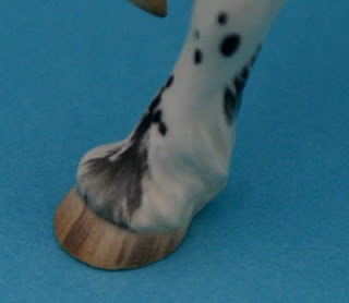
Getting better, but not all the way there yet!
But I began to suspect that part of my problem was in seeing the colors wrong. Artists do this all the time. In my experience most of us are like computer monitors; we are a little "off" from true color. In our industry, this fact can often make it possible to identify a given piece as being by this or that artist, because their color range tilts distinctively towards one (or more) colors. I suspected this was my problem, but after my mare abscessed a hoof and I spent a few days soaking her foot, I really saw how off I was in what color I was registering as proper for a striped hoof. I was also off on just how much variation in color there was on a single hoof.
To illustrate this, I thought it would be neat to share a trick for making your eyes see. If you've ever held artwork up to a mirror to check for proportion, you've used this type of trick. It's all about forcing your eyes to see something - without your brain adding what it thinks it knows first! I'm starting with a photograph of my mare's hoof.
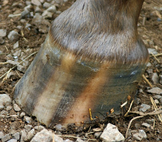
Before I start I should probably give some specifics about the hoof. Sprinkles is heterozygous for the leopard complex (Lp) gene, so this is a typical striped appaloosa hoof. (If she was homozygous for it, her hooves would be shell colored.) It's also the hoof of a horse kept barefoot on a grass pasture, so relatively natural.
Just looking at the photo it is possible to see how different in color the two "shell" stripes are. Taking the photo into Photoshop Elements makes it even easier to see the different colors that make up this particular hoof.
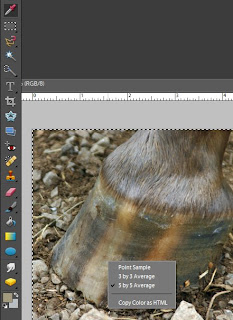
I'll use the Eyedropper tool (at the top left in this picture) to identify to colors. Before I start clicking on the photo, I'll right-click to get the gray menu shown in this picture. You'll want to select "5 by 5 Average". You are looking for a general idea of what color to use in that area, so a number of pixels will give you a more accurate read than just one. Once you have that set, you can start clicking the tool on different areas. When you do, the top color swatch (in the lower left of this picture) will change. You can then double-click on that square of color and Elements will pull up a color mixing menu.

Here you can see the color mixing menu with the selected color (a dull tan) in the smaller box at the top and slightly to the right.
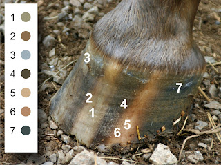
Here I've taken samples in various places on the hoof picture, and placed the corresponding samples beside the hoof. Pulled out from the picture and placed against a white background, it's a lot easier to see (and match to) the colors in the hoof. Notice, for example, how very green the left stripe (1) is compared to how rosey the right stripe (5) is, even though both are "shell colored" stripes.
One of the neat things about this trick is that if you need to match the color, you can use the information in the mixer menu. There are two mixers along the right hand of the menu (HSB and RGB), and the information in those can be fed into a CMYK converter (if like me, you find it easier to visualize with that color model). But even just looking at the mixer menu is helpful since the big square is hue-based, which means it shows the dominant hue (red, orange, yellow, green, etc) of the selected color.
It's still hard for those of us who work in ceramics, since we aren't dealing with the straightforward mixing of pigments. (Our colors are created by chemical reactions.) But knowing the true color needed is helpful no matter what the medium.
Tuesday, August 5, 2008
Little floppy legs are driving me mad
As I have been pondering the molds for the Taboo family, I have come to the realization that I am going to have to confront a technical problem that I have been avoiding.
All molds have problems. Whatever solution you come up with, there is always something that could be done better, if you had the job to do over. In the case of my last mold, the problems centered around stabilizing Al-Hadiye's very slender legs. It's a problem I expect to encounter again with the new guys, so I'm looking at the issue once more.

This is the master mold for Al-Hadiye. It is composed of two plaster supports (in white, on the top and bottom), rubber versions of each mold piece, and a rubber version of the original. If you look closely you can just see the outline of Al-Hadiye's neck and barrel inside the amber rubber.
This rubber master is used to make the working plaster molds. One by one, the rubber mold pieces are removed and a plaster piece is poured in its place. In the end you have a plaster mold surrounding the rubber original. Then the mold is taken apart, the rubber horse is removed, and the mold is reassembled.

Here is that same rubber Al-Hadiye in the picture above. (He looks bubbly, but those are beneath the surface - otherwise the master would not be usable.)

NOoooo! Don't shoot me!
As you can see, he's got floppy legs. These caused all sorts of problems when I was making the mold for him. They wanted to shift around as each plaster piece was poured, making it hard to get a good, clean mold. I tried various ways of temporarily fixing the legs in place, but none seemed like the answer. I considered moving up to a harder rubber product, and I may still try that, but I am not sure any rubber is going to be significantly stiffer in such a thin area. (And Imp's legs are thinner still!) I've even considered taking the front legs off so the molds for them have fewer pieces. It's tempting to do that now with Al, if only to get the chance to work on a true assemble-it-later mold with a familiar piece, before I give it a try with the new guys.
What's funny is that I still remember some years ago, when I first realized how these molds were made. I had been working for a year or so on simple medallion molds when I had that "aha!" moment where it was clear to me how multi-part molds were made. Knowing it seemed so monumental at the time. I'm glad that I didn't have a clue then how little I really knew!
Subscribe to:
Posts (Atom)

