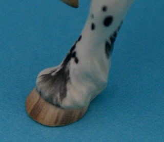
Most recently I spent a lot of time looking at hooves. It was already an area I had targeted to improve with my custom glazes. For various technical reasons, it's a lot harder to get a good hoof on a ceramic horse than a custom or resin.

Getting better, but not all the way there yet!
But I began to suspect that part of my problem was in seeing the colors wrong. Artists do this all the time. In my experience most of us are like computer monitors; we are a little "off" from true color. In our industry, this fact can often make it possible to identify a given piece as being by this or that artist, because their color range tilts distinctively towards one (or more) colors. I suspected this was my problem, but after my mare abscessed a hoof and I spent a few days soaking her foot, I really saw how off I was in what color I was registering as proper for a striped hoof. I was also off on just how much variation in color there was on a single hoof.
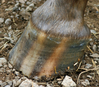
To illustrate this, I thought it would be neat to share a trick for making your eyes see. If you've ever held artwork up to a mirror to check for proportion, you've used this type of trick. It's all about forcing your eyes to see something - without your brain adding what it thinks it knows first! I'm starting with a photograph of my mare's hoof.

Before I start I should probably give some specifics about the hoof. Sprinkles is heterozygous for the leopard complex (Lp) gene, so this is a typical striped appaloosa hoof. (If she was homozygous for it, her hooves would be shell colored.) It's also the hoof of a horse kept barefoot on a grass pasture, so relatively natural.
Just looking at the photo it is possible to see how different in color the two "shell" stripes are. Taking the photo into Photoshop Elements makes it even easier to see the different colors that make up this particular hoof.

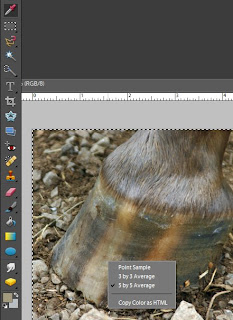
I'll use the Eyedropper tool (at the top left in this picture) to identify to colors. Before I start clicking on the photo, I'll right-click to get the gray menu shown in this picture. You'll want to select "5 by 5 Average". You are looking for a general idea of what color to use in that area, so a number of pixels will give you a more accurate read than just one. Once you have that set, you can start clicking the tool on different areas. When you do, the top color swatch (in the lower left of this picture) will change. You can then double-click on that square of color and Elements will pull up a color mixing menu.

Here you can see the color mixing menu with the selected color (a dull tan) in the smaller box at the top and slightly to the right.

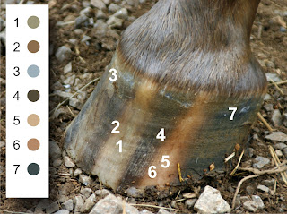
Here I've taken samples in various places on the hoof picture, and placed the corresponding samples beside the hoof. Pulled out from the picture and placed against a white background, it's a lot easier to see (and match to) the colors in the hoof. Notice, for example, how very green the left stripe (1) is compared to how rosey the right stripe (5) is, even though both are "shell colored" stripes.
One of the neat things about this trick is that if you need to match the color, you can use the information in the mixer menu. There are two mixers along the right hand of the menu (HSB and RGB), and the information in those can be fed into a CMYK converter (if like me, you find it easier to visualize with that color model). But even just looking at the mixer menu is helpful since the big square is hue-based, which means it shows the dominant hue (red, orange, yellow, green, etc) of the selected color.
It's still hard for those of us who work in ceramics, since we aren't dealing with the straightforward mixing of pigments. (Our colors are created by chemical reactions.) But knowing the true color needed is helpful no matter what the medium.


6 comments:
Tis a grand thing, the computer! Such a helpful tool in so many ways!
Back when I was creating exhibits, my computer helped me honor certain aspects of the American Disability Act; for example, the ADA mandates a 70% color contrast between background and type face.
After designing the text and sign color, it could be "gray scaled" in Photoshop, and the saturation of grays could be"read" by the program to determine if the 70% contrast had been met. My eye was trained pretty quickly to "see" the correct contrast, the more I worked in Photoshop this way.
Even though I am five years away from working on exhibits, I can still look at a sign in a zoo or museum and tell if it complies with the ADA!
This is a fantastic idea, I had never even thought of using Photoshop for looking at color like this before -- thanks for the tip!
Now if I could only mix the color that I see... ;-)
I remember a professor in art school---he was very into landscape and watercolor---talking about how there was no true black in nature. This is an idea that I run hot and cold about; but it does seem that "grays" in nature are never that same pure gray that pigments achieve when "black" black is mixed with white, So Sprinkles' grays in her hoof are going to more green or pink or blue, because the dark coloring isn't "true" black...
Carol, you can try mixing your colors with cyan, magenta, yellow and black using the proportions the computer mixer gives you.
The tan color in the blog picture translates to a CMYK of:
cyan - 28
magenta - 29
yellow - 48
black - 0
So if you mix almost equal amounts of cyan and magenta paint, then add a bit less than double that of yellow, you should get something pretty close.
The art school I attended required first-year students to mix all their own paints from those four print colors (plus white, if needed). We were told any color was possible if we had those, though I'll admit some colors are easier to obtain if you have primaries (true red in particular) to work with as well. It seemed silly at the time, but it really helped me to understand color better.
Brilliant Lesli!
And thanks to Ms. Sprinkles for having such an interesting hoof. :-)
When I do hooves, I always sprinkle a lot of random color across it and try explicitly not to blend it too smoothly. Horse hooves always seem to have a lot of random variation in them, with bits of dark and light and red and yellow. I hadn't thought about green before, but upon reflection, mel is right that there are some greenish bits in most dark hooves.
But yeah, in ceramics, even harder!
Post a Comment