Thursday, July 17, 2008

Best Wishes!


Today the custom glaze classes run at the North American Nationals. Results have been posted in real time as they usually are, but there haven't been photos as there have been in past years. That has meant that I couldn't really follow the results from the last two days, but today at least I know many of the horses by name. So best wishes to all the custom glaze entrants from one of the at-home spectators!

(Pictured is Mel Gaulding's Asheville at the 2006 Nationals. He's still one of my all-time favorites.)

Tuesday, July 15, 2008

A winner!

Thank you everyone who sent such kind words about the blog. I have really enjoyed doing the blog this past year. It's such a great format for sharing information. I've always loved doing that, but informal nature of a blog sure makes it easier for me. I love not having to write anything polished and complete, like I would for a formal article. (And of course, not having publishing deadlines doesn't hurt, either!)

I went through all the comments and emails, assigned everyone a number and the random number generator pulled up modelhorsecollector (Tracy). So Tracy if you send me an email with all your information, I'll send the bracelet out to you.

Monday, July 14, 2008

One-Year Anniversary!


Woo hoo! It's the blog's one year anniversary today and what better way to celebrate than a giveaway? This time it's a bracelet with a small blue-green Celtic Pony bead, glass pearls and seed beads and antique copper findings.

At the end of the day I'll draw from the names of those who post here in the comments. (If you have trouble posting, you can email me directly to be included, too.)

Friday, July 11, 2008

"Circle of Friends of the Medallion"


In my post yesterday, I forgot to include another thing I found that was interesting. The exhibit had a display about the Circle of Friends of the Medallion. This was how the organization was described by its founders:

a band of artists and lovers of the arts, of both sexes, who hope to encourage in the public a taste for small sculptures and especially for bas-relief. Designs are chosen by the Art Committee. Medals and other sculptures issued by the Circle go to members only, without charge beyond the annual dues. They are not offered publicly for sale. They are of bronze, unless a costlier metal is called for at an additional cost.

As you can see from the picture, the medals were set inside a hardbound book with an essay on the piece. The Society was established in 1909 and the final edition was issued in 1915. It fascinated me that in that era it was actually feasible to not only produce a bronze medallion but fabricate a small edition of books with a die-cut recess just to hold it an the accompanying literature. The cost of doing something like that today would be prohibitive. (My husband would say that this would be precisely to appeal to me - a lovely thing so time-intensive to make that no one could ever make it a viable business!)

Still, the basic idea behind the Society was interesting to me. It would be possible in our community to issue a yearly medallion and package it in an appealing way. Of course I'd be more interested in ceramic medallions than bronze, but that's my own bias showing! I just wonder if there would be enough interest that such a 'society' would have members?

Thursday, July 10, 2008

Medallic Art


I wanted to take a moment to congratulate the winners of the first Bas Relief Exhibition held by the Realistic Equine Sculpture Society (RESS). The organization has encouraged those interested in equine sculpture to create and sponsor special exhibition awards, and since I was so tickled they were recognizing relief work that I asked to give one for the "Best Narrative". My winner was Kelly Savage's Fly Fishing, pictured above. (Kelly is another blogger, too, and I've added her link to the blogs list here. It's a really neat one, so check it out!)

Judging the entries reminded me that I had never posted about the medallic art exhibition I attended at Brookgreen Gardens this past spring. Perhaps now is a good time!

I went to the exhibition not quite knowing what to expect. Bas relief seems to be a dying art - even more so than earthenware slip-casting! I've searched for a society or organization, or even just literature on the art form, without finding much that is current. My hope was that, in viewing the exhibit, I might find some sign that there were actually artists still creating realistic relief sculpture.


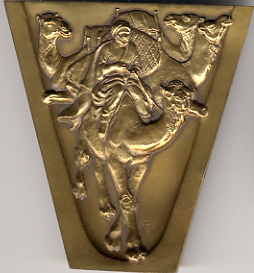
(left to right) Athenian Owls, by Julian Hoke Harris; Honor to Socrates, by Robert Weinman; Eskimo Dog Team, by Patricia Verani

What I found was that while we in the equine collectibles community tend to call all relief art "medallions" (when we aren't using the informal "cookie", that is!), in the artistic community the term has a slightly more specific meaning. Medallions are pieces of relief art that are small enough to be comfortably held in the hand. In that, all but the largest of our "medallions" would qualify. Where medallic art differs is that the design is two-sided, and almost always struck in medal.


These pictures illustrate each step in the process of striking the medallion. It starts with a blank bronze disc, called a planchet. The image to the right of that is the first strike. As you can see, much of the detail is not yet present. (You can click on the picture to get the larger image.) The piece is then struck three more times (the next three images). The piece is then trimmed - each strike creates more 'flash' around the rim - and given a patina. It was neat to see these step-by-step examples. Certainly a very different process than dealing with fragile greenware. We don't do striking, that's for sure!

The other aspect that I mentioned before as being different was that these pieces are designed to be two-sided, much like oversized coins. To my knowledge, no one in our industry has made something like that. As I was looking at the exhibition displays, I could see why. Most of the pieces were displayed upright on clear stands. (I wish I could find some that small and that quality.) The image on the reverse was mostly hidden.


In fact, the only practical way to display both sides was to place two of the same one side by side. Practical, I suppose, for a museum or gallery that has two copies, but not so much for the average collector!


Still it was an interesting concept. Many of the artists did really neat things with the reverse side of their pieces. The eskimo dogs above, for example, flip upside-down on the reverse and become a group of domestic camels. Many of the artists also made creative use of cut-outs in their designs.


(left to right) Sister Cities, by Tuck Landland; Capture/Escape, by Richard McDermott Miller; The Sculptor and The Garden, by Alex Shagin.

While the exhibit was more limited in scope (particularly in medium) than I had hoped, it gave me a lot to think about. I'm not sure there is any real market for two-sided designs in our community, especially not when most of our pieces are also offered in resin for cold-painting. But it did have me thinking more three-dimensionally about the designs, as well as thinking about negative space in the form of cut-outs. And while the medallion societies that spurred the creation of many of the pieces in the exhibit are no longer around, I have to wonder if there are other pockets of relief artists out there much like ours. Surely equine sculptors aren't the only ones who have found it interesting to work in relief.

Monday, July 7, 2008

Thinking of Lexington


We spent the holiday weekend visiting my husband's family in Cincinnati. Normally we go through West Virginia to get to Ohio, but I had arranged to meet with fellow ceramic artist Marge Para on the return trip. Marge's husband Gary makes the kind of high quality slip I use, and I wanted to pick some up in person. Meeting near Lexington isn't the best way to get slip. Visiting Marge's pretty farm in rural Kentucky, and enjoying her wonderful hospitality, is a much better deal! But saving postage on six heavy buckets of mud isn't a bad, either.

My trip took me right past Iron Works Parkway, at exit 120, leading to the Kentucky Horse Park and Newtown Pike, at exit 115, leading to the Holiday Inn North. They were both relatively empty as we drove through Sunday morning, but in a few short weeks they will be packed with people attending the North American Nationals and BreyerFest. Sadly, I won't be among them. My mother is retiring after what seems like a lifetime (well, my lifetime at least!) working at Wal-Mart, and I will be in Alabama celebrating. But seeing those familiar places sure made me wish I wasn't going to miss it all.

So best wishes to everyone attending, and to everyone feverishly finishing sales items these next few weeks!

Wednesday, July 2, 2008

Tick, tick, tick


By now I think everyone is probably tired of posts about ticking! I know that I'm going to be just as happy not to see any more #11 blades for a while, once this guy is finished.

And part of why he is taking so long is that ticking is the kind of work that must be done in small sessions. It really is impossible to do that kind of repetitive work for long before your mind goes on autopilot. Once in autopilot, the texture becomes too regular, too symmetrically patterned. To keep the work looking like a hair coat and not just lines representing hairs, it takes frequent breaks. ("Step away from the little speckled pony. Just step away!")

That's why I often set up some experimental pieces. They help lure me away from too much mindless ticking. My current experiment deals with overlapping colors. It's a long-standing puzzle for those of us that underglaze earthenware pieces. If color must be applied by airbrush (and underglazes must), and the sprayed areas are too fragile to mask, how do you get crisp delineations between the colors?

One of my earliest discoveries was that certain kinds of underglaze fired with a sheen. If I used this type of pigment for the background of a plaque, I could spray over it with the regular underglaze that I use and wipe off any excess.


That's what I've done here with this plaque. The sheen is visible on the green background, while the mane (done in normal underglaze) is matte to the point of being chalky. I couldn't use the same type of underglaze that is on the background, though, because I want to go back in to the mane with some hand-painting. The same sheen that makes it possible to wipe off the overspray would make it impossible to paint that kind of detail.

But I would like to be able to wipe the mane clean. I plan to make the mare rose gray, so I'm going to get some overspray on that brown mane. Chances are the grays are going to be pale enough that they will just sink below the dark brown, especially if I wipe off the heaviest areas. Still it is impossible to get it all off, even on the slicker bone china surface. You can see this with the light gray residue left on the ends of the mane tendrils on the bone china Lirico above. With him, those mane ends are black so those lighter areas won't be visible when the horse is done. They will sink below the darker color. But this plaque is earthenware, which is more porous. More residue will be left behind, and it could tint my mane more gray. That wouldn't be terrible, but I would like to try to keep it a true brown.

My experiment, then, is to see if I can detail and glaze the mane, then go back and finish the rest of the horse. One of the things I learned while I was in Boise recently was that my regular pigments don't have to fire as hot as I thought. The temperature I thought I needed for underglaze is too high for actual glaze, so applying it had to wait until the very end. If I could fire underglaze and glaze at the same temperature, I might be able to "seal" finished areas in glaze and then move on to other areas.

I'm not sure it will work, and I probably shouldn't use my nice medallion triptych from Sarah to test out the theory! But it's easy to fall into the trap of valuing bisques overmuch and sticking with "safe" colors and techniques, so I'm going to see if it works.